
TaskFlow — a task manager for small teams
// Goal
Sell simplicity in a category where every competitor sells features. The audience is freelancers and small teams already tired of heavy systems.
// Brief
Show the product through the scenarios of a single day, and prove the promise of simplicity through the structure of the page itself.
How we built it
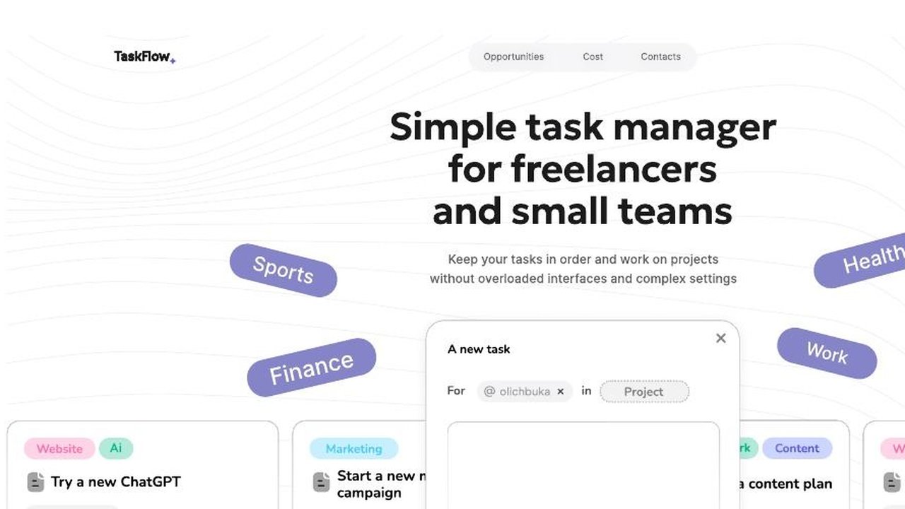
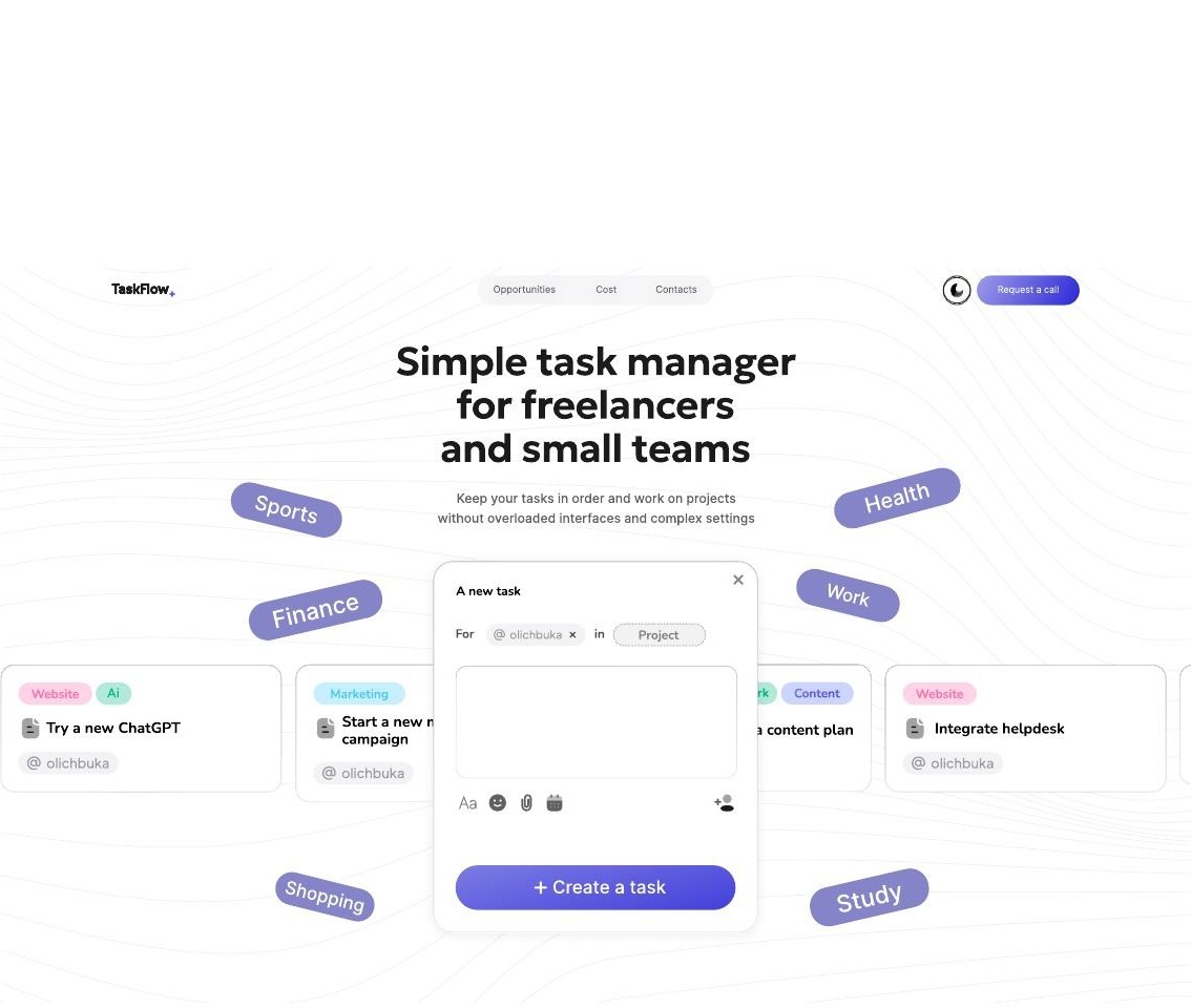
A promise of simplicity is tested on the first screen: if that screen is complicated, nobody believes the rest. So the first screen carries one formulation — a simple task manager for freelancers and small teams — surrounded by a cloud of real areas of life: work, health, sport, finance, study, shopping, marketing, content. The product immediately reads as a tool for everything, not for a corporate project.
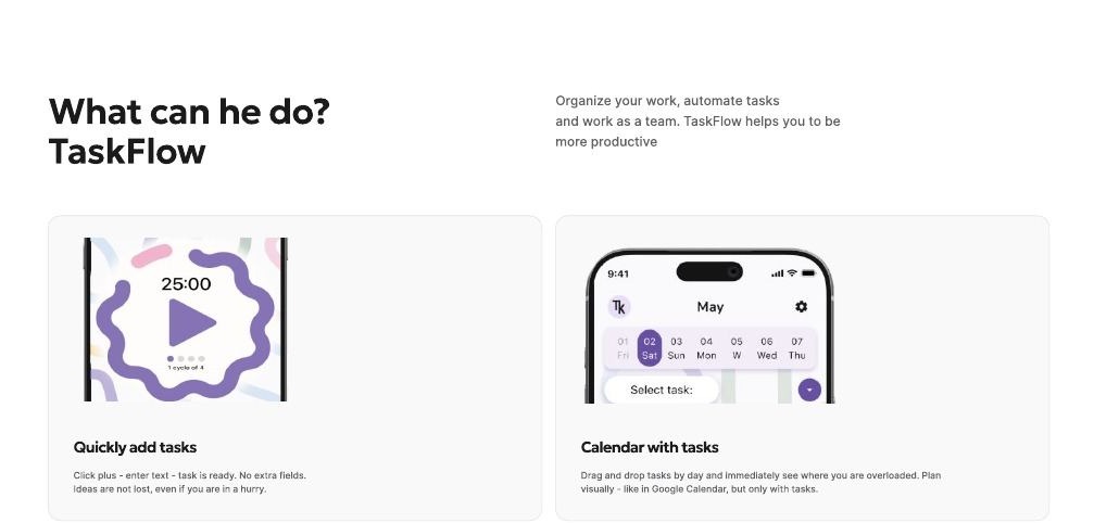
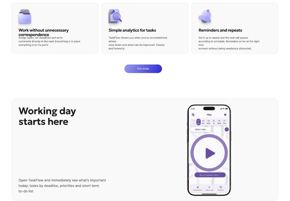
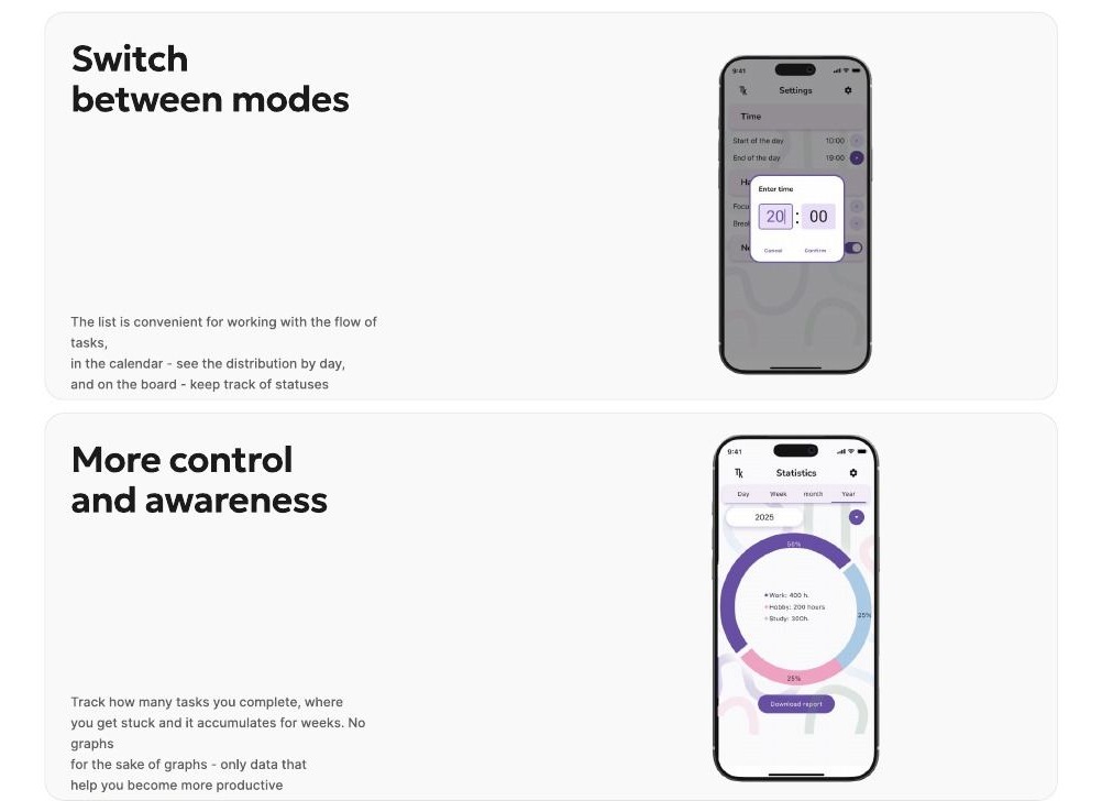
Four capabilities follow, each shown through a scenario. Adding a task fast: plus, text, done, no extra fields. The calendar: tasks drag between days so overload is visible at a glance. Working without extra correspondence: assignee, deadline and comments inside the card. Simple task analytics — exactly as much as a small team needs.
Stages of delivery
The first screen as a promise
A single statement of simplicity, ringed by the areas of life it covers — from work and finance to sport and study.
Fast capture
A three-step scenario with no required fields, so a task is recorded faster than it can be phrased.
Calendar with tasks
Dragging between days with overload visible immediately — calendar planning, but about tasks only.
Working as a team
Assignee, deadline and comments inside the task card, keeping the discussion out of messengers.
Task analytics
Straightforward reporting on volume and status — a level of detail matched to a small team.
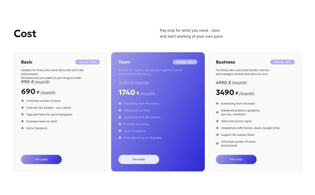
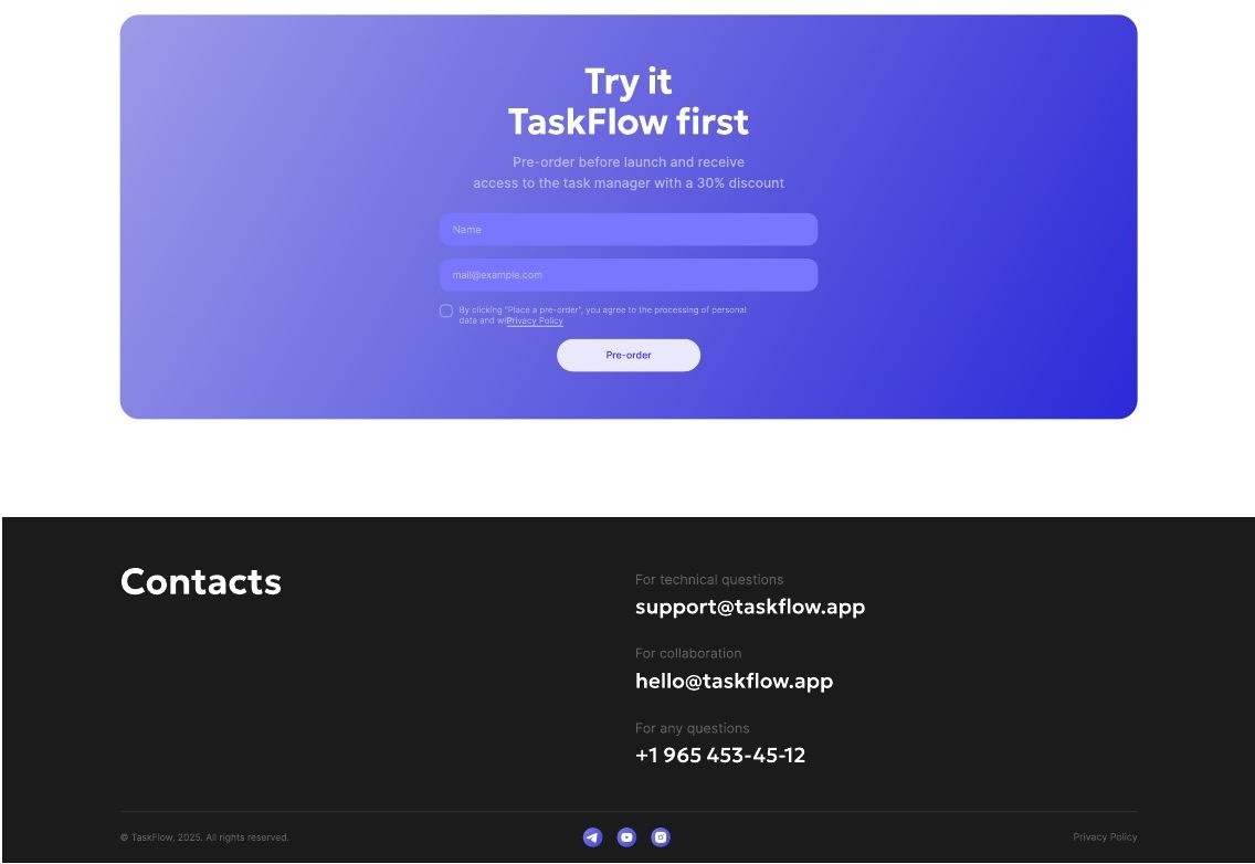
Pricing and contact
Cost and contact sections closing the page on a decision to sign up.
Outcome
A six-screen mockup where the promise of simplicity is confirmed at every step: a short first screen, capabilities shown as scenarios, and a minimum of required actions in the interface.
The Russian version has been built and published — link below. The English mockup remains in the gallery.
The site opens in a new tab.
Other cases
Want the same outcome?
Tell us about the task — we will design, build and ship a solution for it.