
VAVA — identity for a marketplace for dogs
// Goal
Create an identity for a marketplace that both delivers food and toys and books grooming, training and veterinary visits. The style has to read as a shop and as care at the same time.
// Brief
Assemble a full brandbook with usage instructions — logo, palette, typography, iconography, pattern, button states, a 404 page, a pop-up notification — and apply it across the app screens.
How we built it
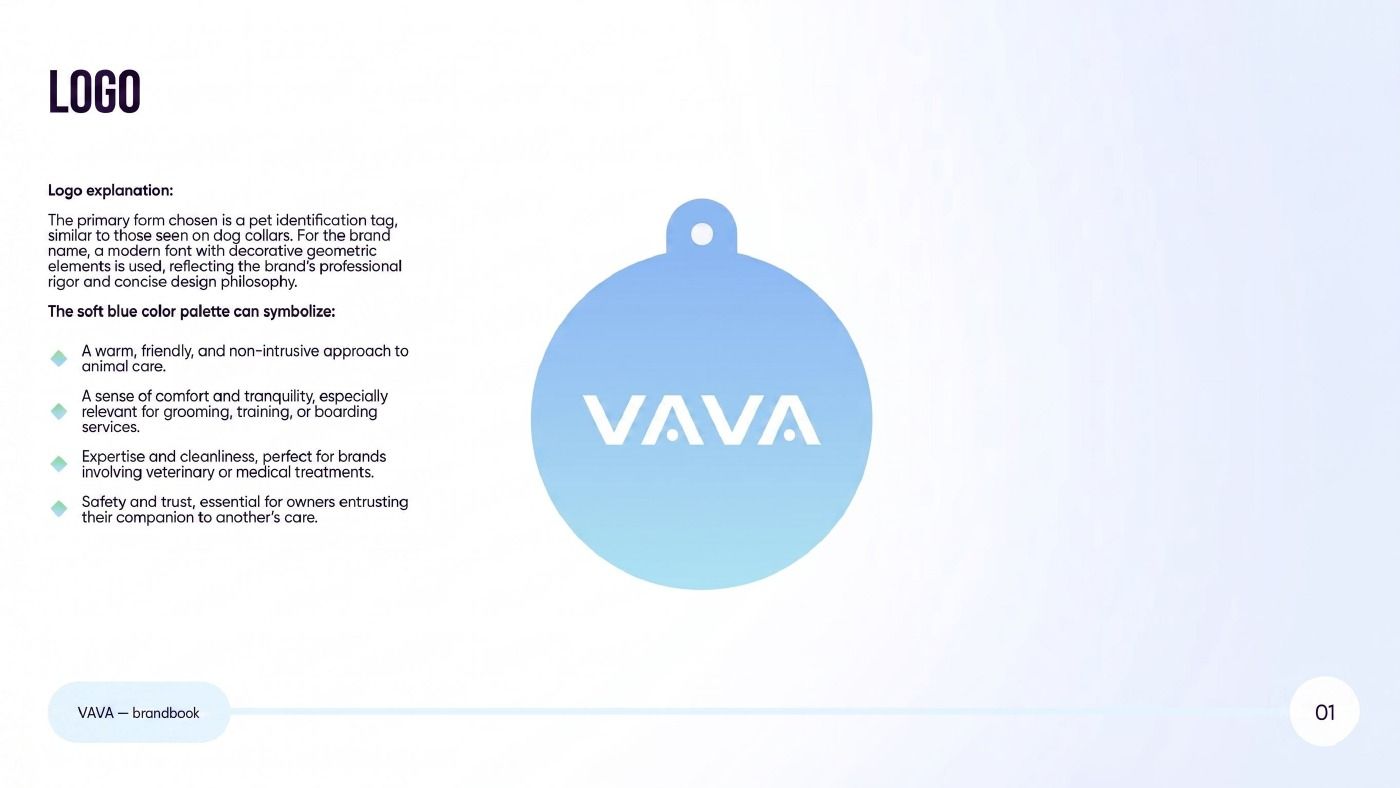
The entry point is the shape of the logo. We took the identification tag from a collar: an object every dog carries, meaning “this pet is looked after”. The wordmark uses a modern typeface with geometric decorative elements, reflecting the brand's precision and restraint. The soft blue is a deliberate choice: it reads as a warm, non-intrusive approach to the animal, as comfort for grooming and training, as cleanliness and expertise for the veterinary side, and as safety for an owner entrusting their dog to someone else.
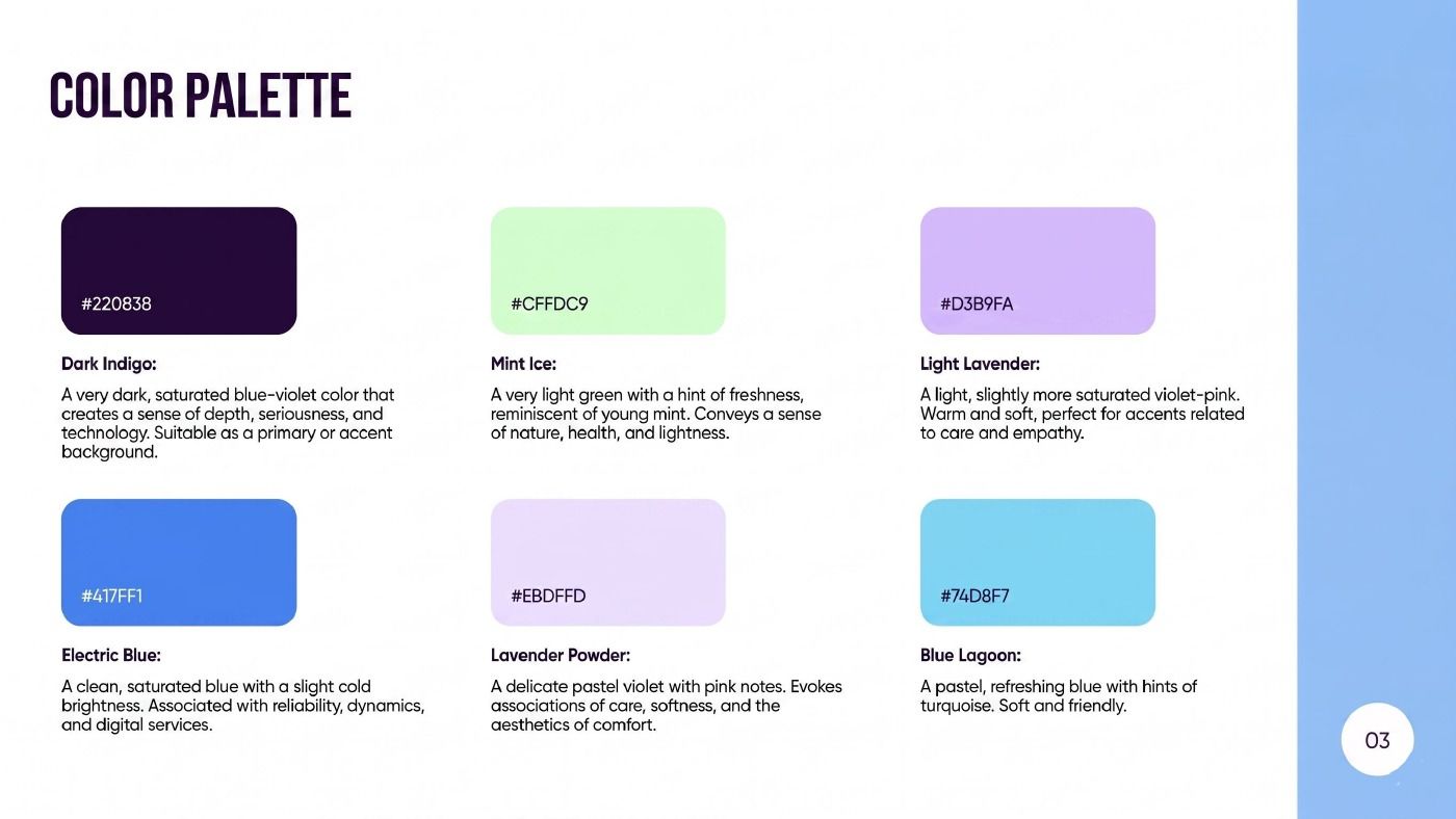
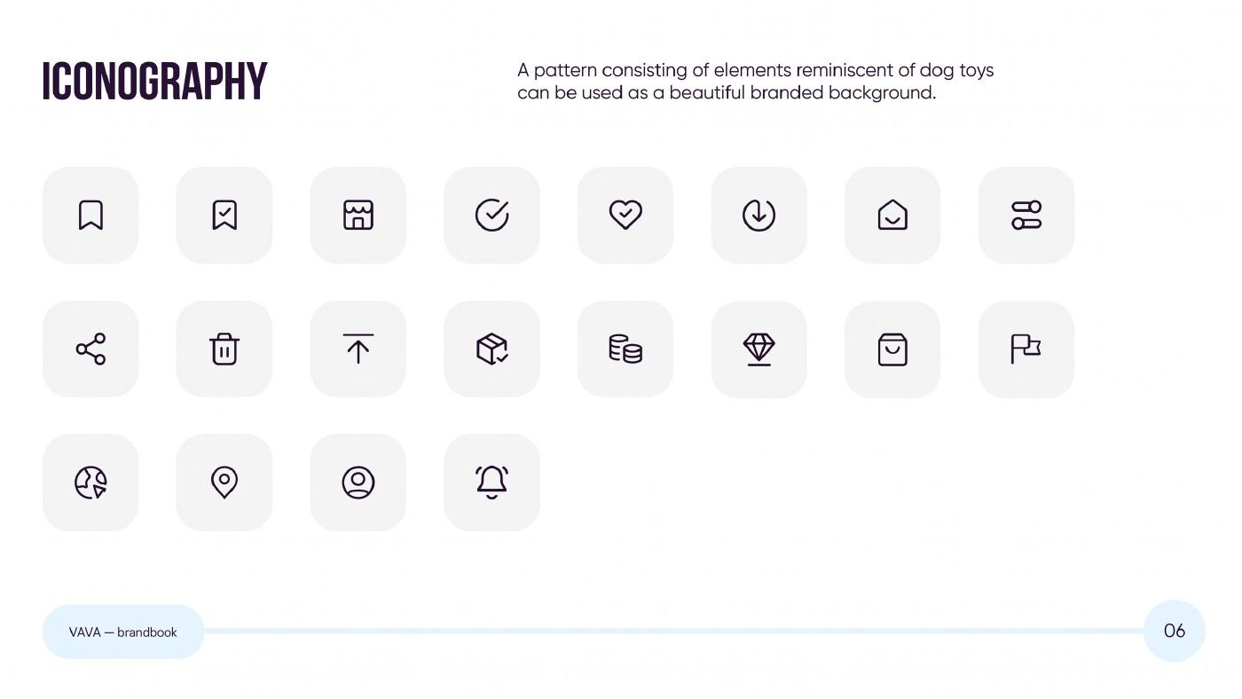
The palette is built from six colours with fixed roles: dark indigo #220838 as the primary, soft mint #CFFOC9 and light lavender #C089FA for accents, electric blue #1571F1 as the saturated working colour, lavender powder #E8DFFD and blue lagoon #74D8F7 for pastel states. The iconography runs to twenty icons on a shared geometry, and the pattern is assembled from elements reminiscent of dog toys, working as a branded background.
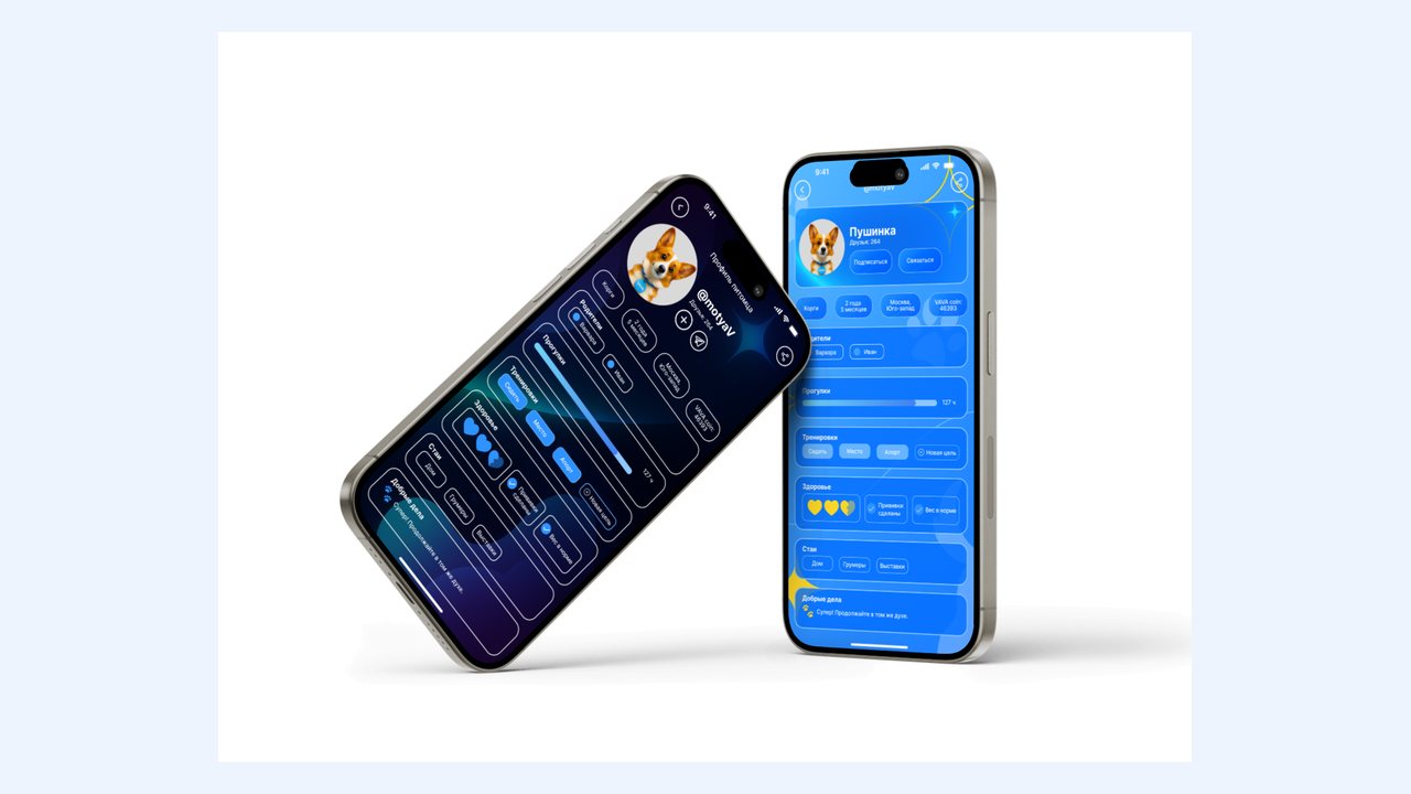
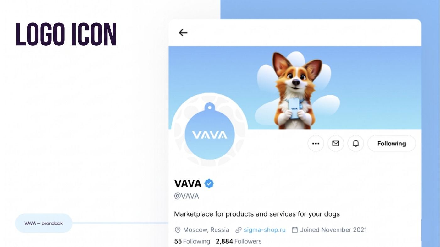
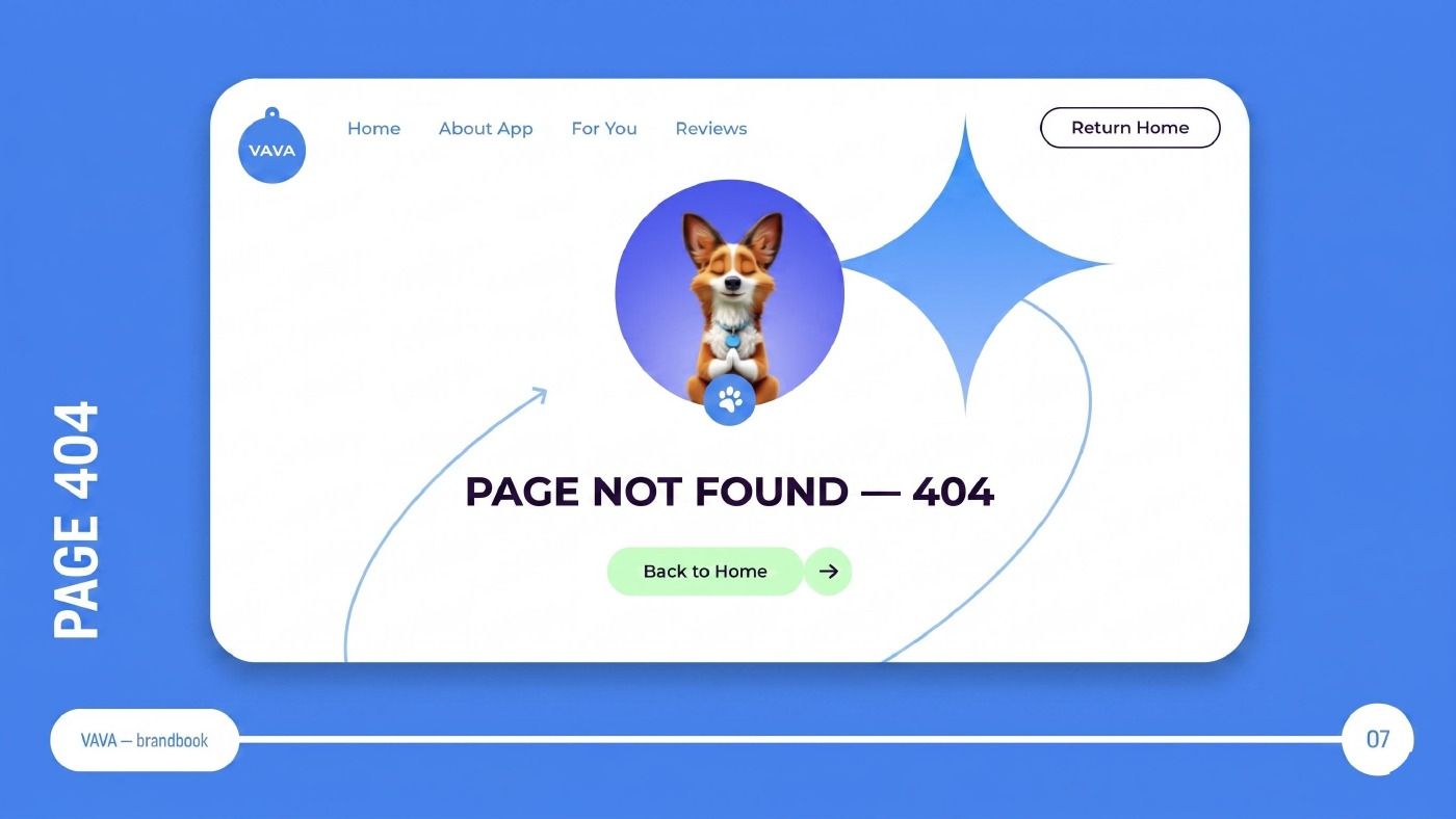
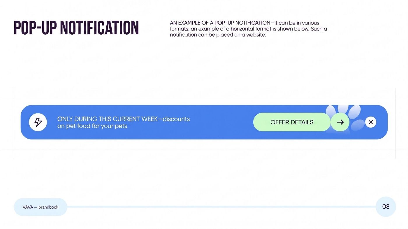
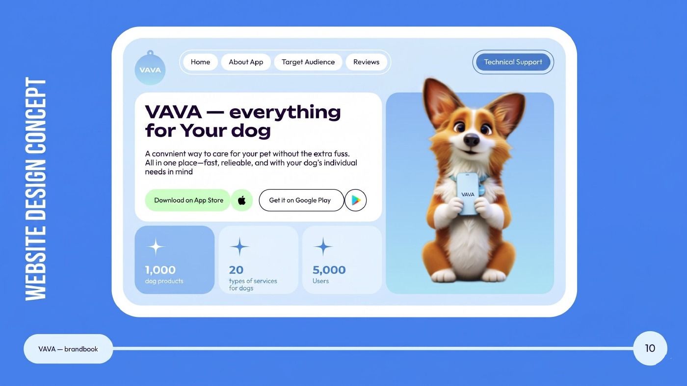
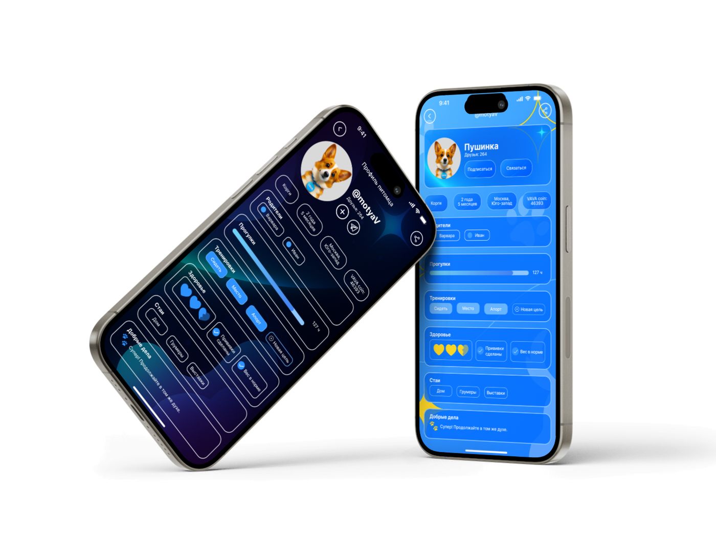
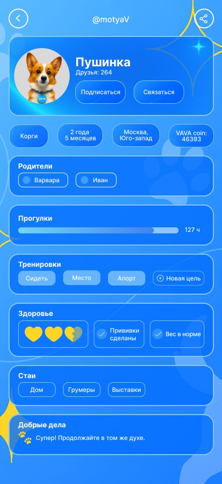
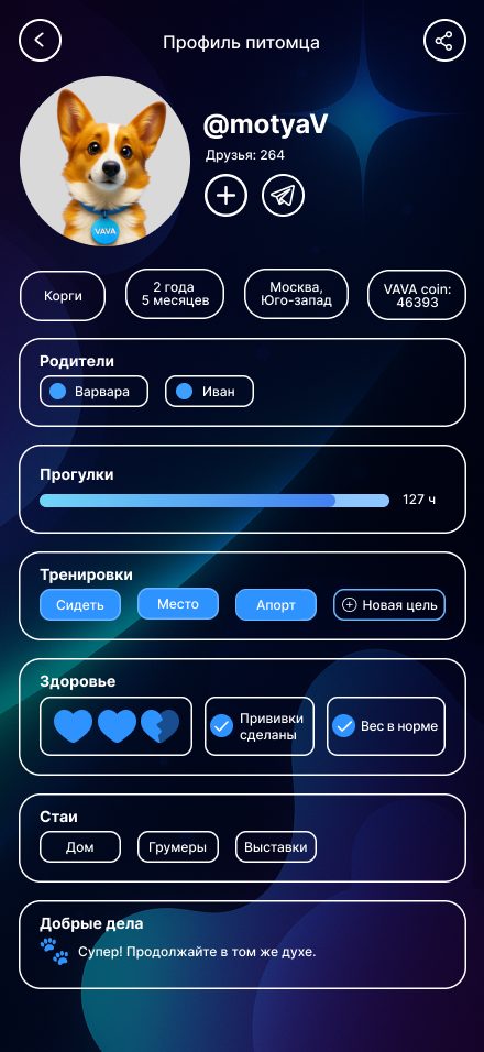
The brandbook documents live situations as well as constants: a 404 page with the character, a horizontal pop-up notification about discounts on pet food, the logo thumbnail as it appears on a social profile, button states for confirming, declining and cancelling an order, and a website design concept. The app screens — a pet profile with walks, training, health, packs, good deeds and the in-app VAVA coin — are drawn in light and dark themes.
Stages of delivery
Logo and its reasoning
The collar-tag form, a modern typeface with geometric elements, and an account of what the soft blue palette symbolises.
A palette of six
Dark indigo, mint, light lavender, electric blue, lavender powder and blue lagoon, each with a described role.
Typography and iconography
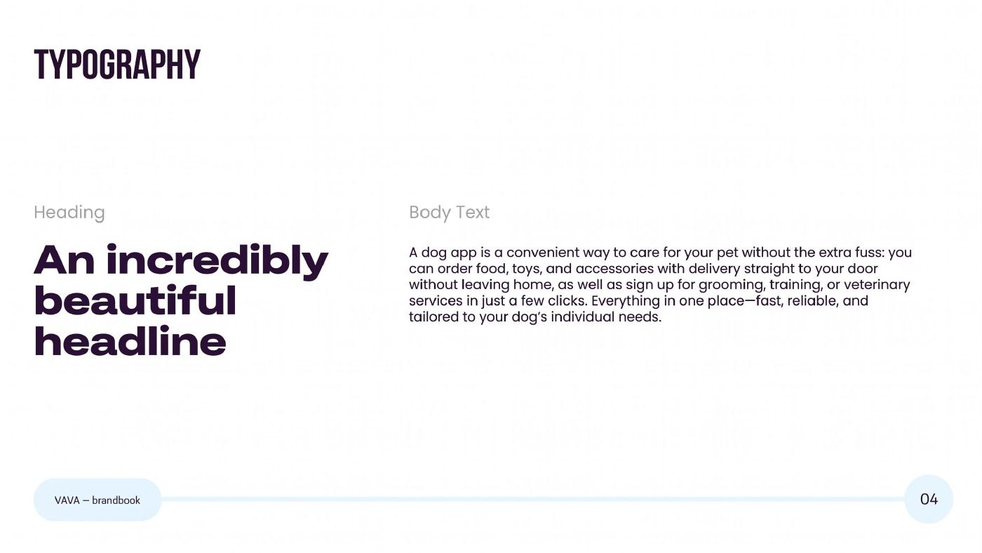
Heading and body levels plus a set of twenty icons built on a shared geometry.
Pattern and backgrounds
A pattern of elements reminiscent of dog toys, usable as a branded background.
Live situations
A 404 page with the character, a discount pop-up, the social profile thumbnail, button states and a website design concept.
App screens
The pet profile — walks, training, health, packs, good deeds, VAVA coin — in light and dark themes, with a device mockup.
Outcome
An 11-spread brandbook with usage instructions: the logo and its rationale, a six-colour palette with roles, typography, twenty icons, the pattern, button states, the 404 page, the pop-up notification and a website concept.
The identity is applied across the app screens — a pet profile in light and dark themes. The brandbook was produced in Russian and English.
Other cases
Want the same outcome?
Tell us about the task — we will design, build and ship a solution for it.